Mori Coffee
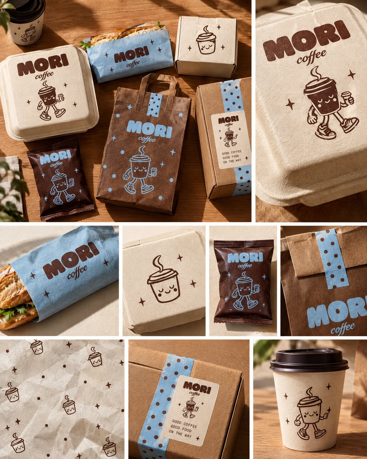
A walking-cup mascot and a cocoa-and-sky palette for a café that wants every cup to feel like a good day.
- Client
- Mori Coffee
- Role
- Creative direction, brand identity
- Deliverables
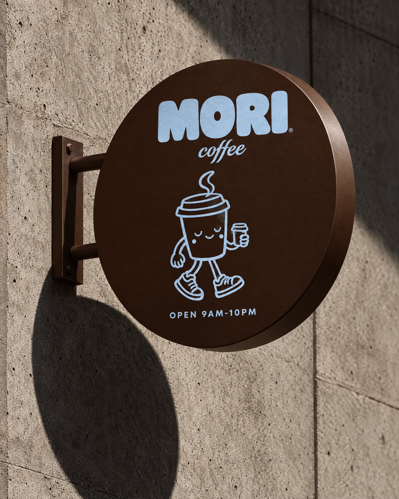
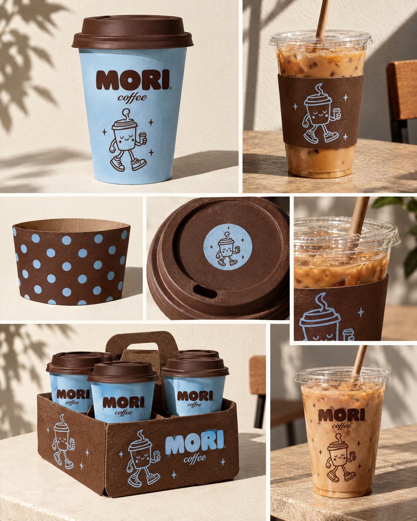
- Logo, mascot, packaging, signage
- Year
- [Year]
01The brief
[Replace with the real brief.] Mori needed a brand that stood out in a crowded café scene: friendly enough for everyday regulars, distinctive enough to be remembered after one visit.
02The idea
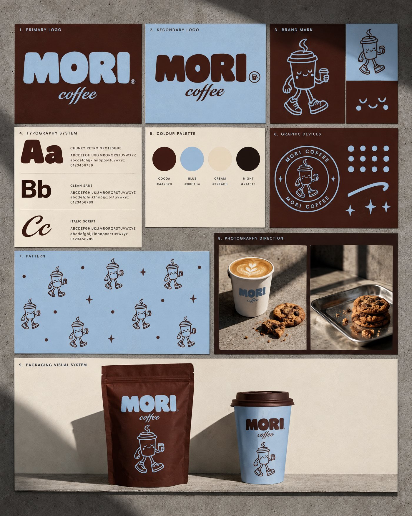
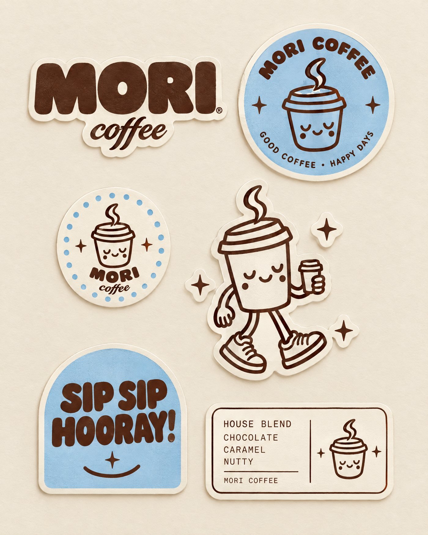
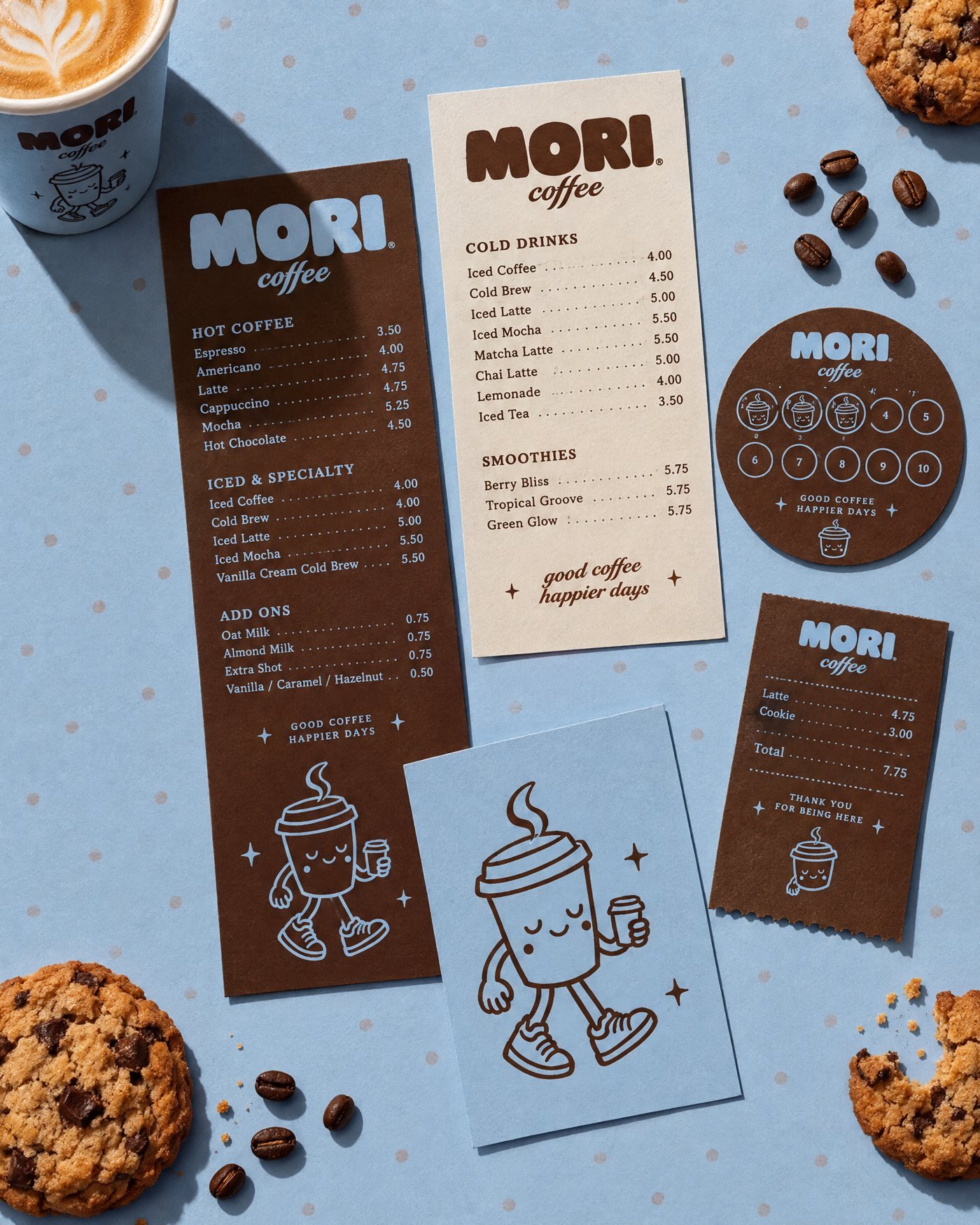
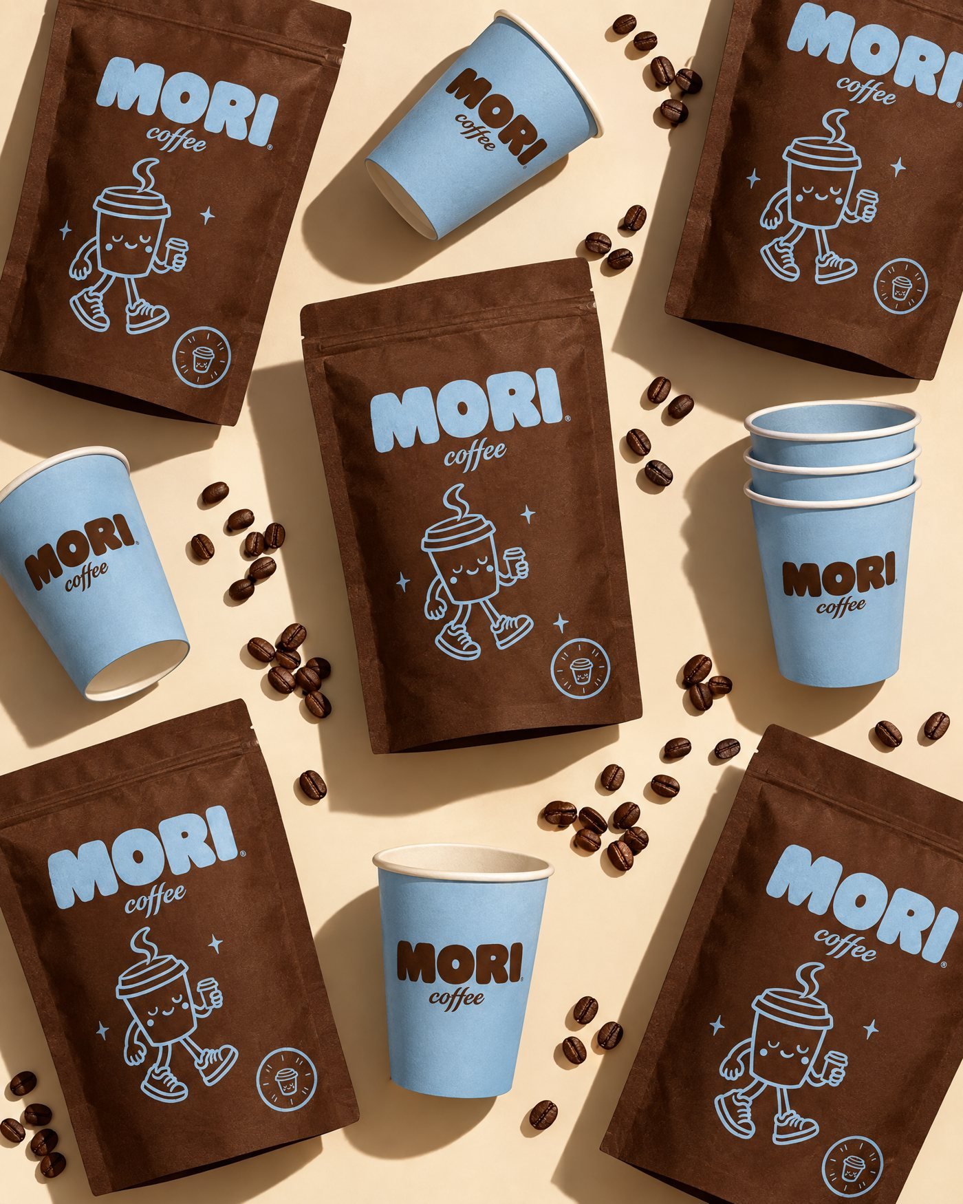
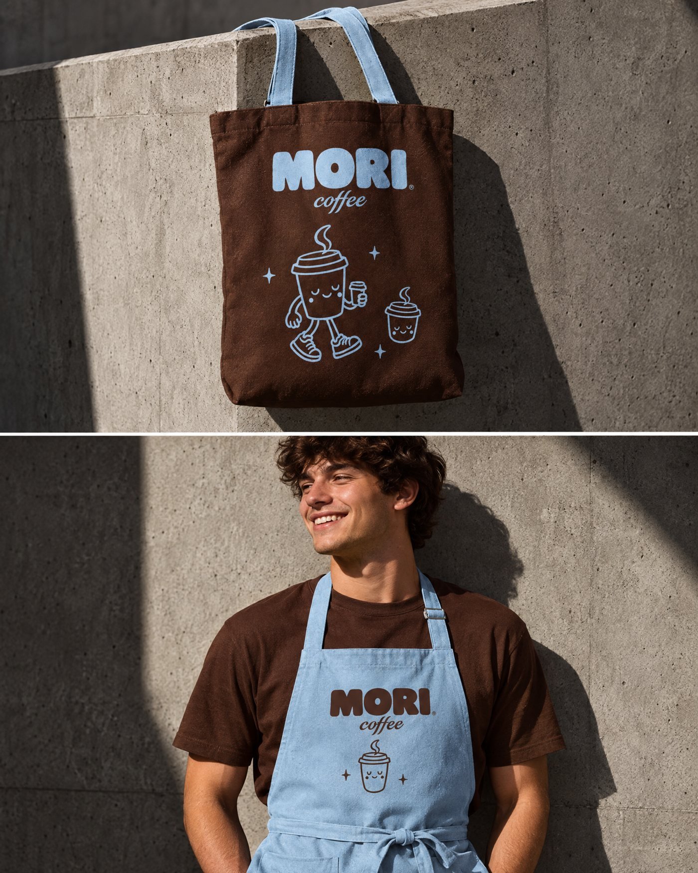
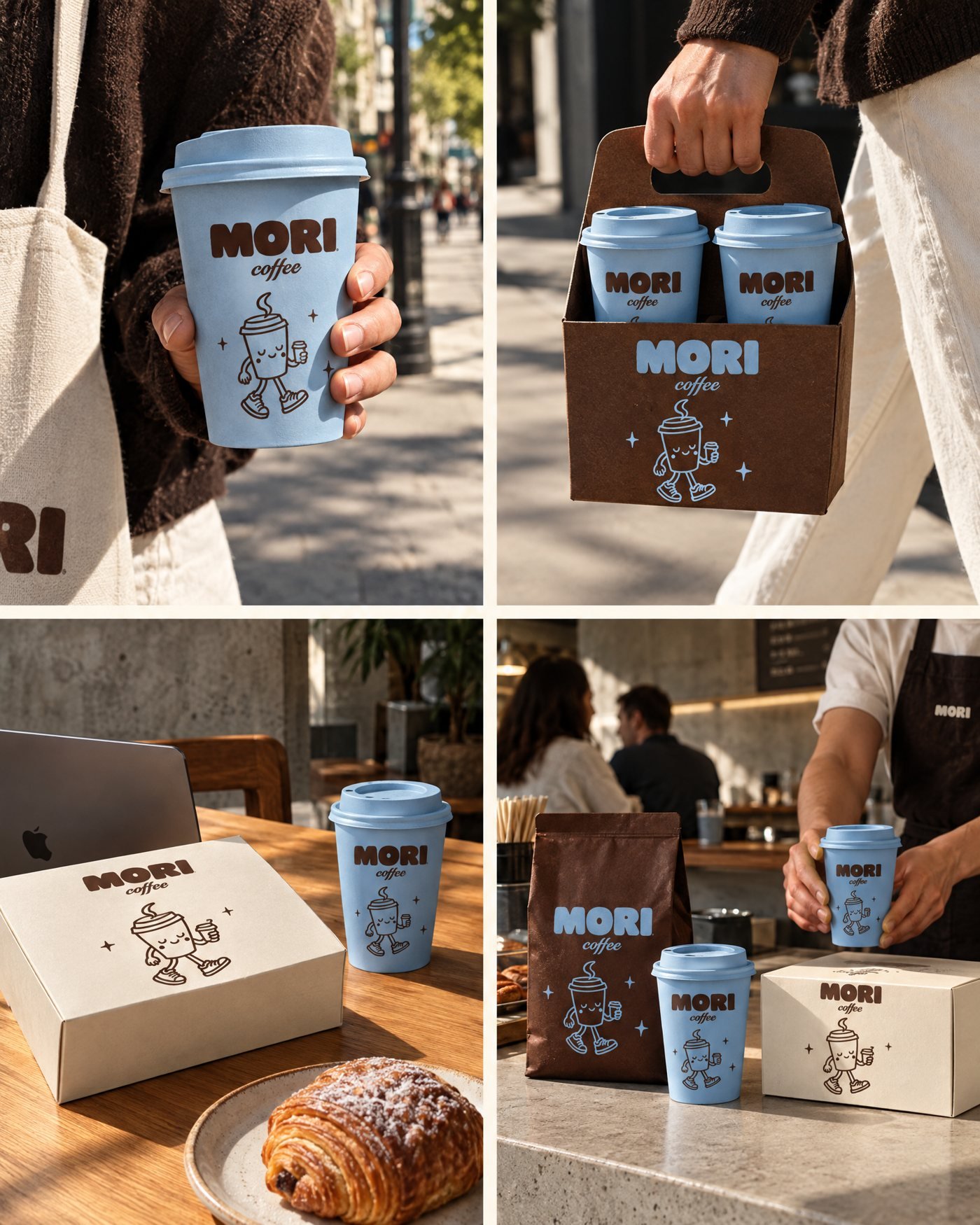
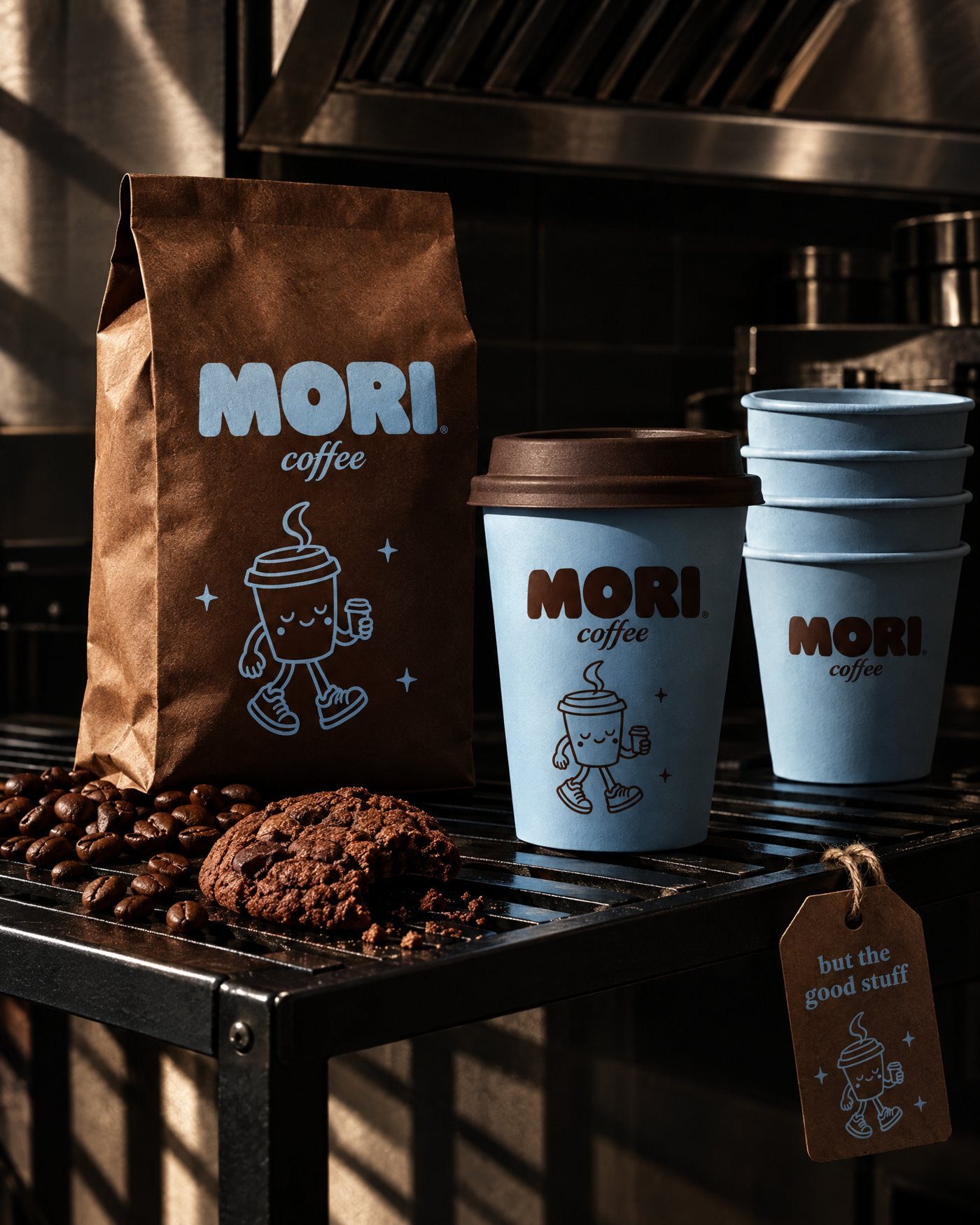
A cheerful walking coffee cup, holding its own little coffee. It became the mascot on every touchpoint, from cups and bags to stickers and signage.
Paired with a chunky retro wordmark, a flowing "coffee" script, and the line good coffee, happier days.
03The identity
- Primary and secondary logos, plus a mascot brand mark
- Typography: chunky retro grotesque, clean sans, italic script
- Graphic devices: badge, polka dots, sparkles, a smile swoosh
- Packaging, menus, loyalty card, stickers, merch and signage
Cocoa #4A2320
Blue #B0C1D4
Cream #F2EADB
Night #241513